Take it

Monday, January 18, 2010
permalink | comments (0) | backlinks | ![]()
![]()
Corinne's blog of randomness.
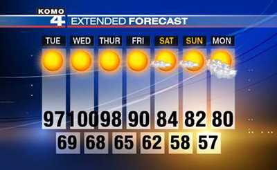 Clearly Seattle is experiencing unusual weather. Our weather forecast wasn't designed to accomodate three digits.
Tuesday, July 28, 2009
permalink | comments (0) | backlinks | ![]()
![]()
Wednesday, October 01, 2008
permalink | comments (0) | backlinks | ![]()
![]()
This is a pretty inspiring conversation in our current world state. The animation is beautiful, compelling, and fluid.
Thanks to Richard for the link. rb.log» Blog Archive » John Lennon Interview Animation
Labels: design
Thursday, August 21, 2008
permalink | comments (0) | backlinks | ![]()
![]()
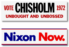 Logoblink has an interesting collection of presidental logos from 1960 to the present. It's makes for a fun scroll. USA political election logos 2008 - 1960
Friday, May 16, 2008
permalink | comments (0) | backlinks | ![]()
![]()
This is an interesting article that tests the validity of the "Three Click Rule" of web design--namely that nothing should be more than 3 clicks away from the user. This research found that there was correlation between task success or user satisfaction and the number of clicks. I think this astute observation at the end of the article nicely sums it up.
"The Three-Click Rule isn't completely bad. People talk about it with users in mind, even executives who have never designed a web site. The rule may help designers focus on the information that users need and may help them create better web sites....
However, the Three-Click Rule does not focus on the real problem. The number of clicks isn't what is important to users, but whether or not they're successful at finding what they're seeking."
An interesting aside in the article that I wasn't expecting.
"[I]n one e-commerce study, we found that the more pages users visited (more clicks), the less they bought."Read the article: Testing the Three-Click Rule
Labels: design
Tuesday, January 15, 2008
permalink | comments (0) | backlinks | ![]()
![]()
I agree with the general thrust of this article, though I haven't visited and reviewed each of the portfolios cited. Looking at the miniature versions of the site though, it seems like a reasonable selection. 10 portfolios that get right to the point
Labels: design
Thursday, July 26, 2007
permalink | comments (0) | backlinks | ![]()
![]()
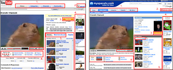 This strikes me as a great example of the power of visuals to get a point across in milliseconds.
Article: MySpaceTV vs YouTube: 12 Things MySpace Copied
This strikes me as a great example of the power of visuals to get a point across in milliseconds.
Article: MySpaceTV vs YouTube: 12 Things MySpace CopiedLabels: design, technology
Thursday, June 28, 2007
permalink | comments (1) | backlinks | ![]()
![]()
Wednesday, February 21, 2007
permalink | comments (0) | backlinks | ![]()
![]()
 This really effectively gets to the heart of what American Apparel is all about. Very effective in reinforcing why it's worth buying from them even though their clothes are much more expensive than the equalivent stuff made overseas. Not that I've shopped there...
Seen on design fckr.
This really effectively gets to the heart of what American Apparel is all about. Very effective in reinforcing why it's worth buying from them even though their clothes are much more expensive than the equalivent stuff made overseas. Not that I've shopped there...
Seen on design fckr.Labels: design
Wednesday, February 21, 2007
permalink | comments (0) | backlinks | ![]()
![]()
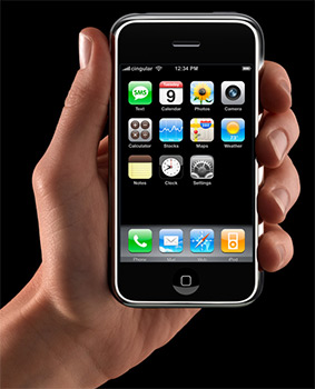 There is a lot of Apple envy today among user interface designers, and others, around the world. Steve Jobs announced the release of Apple's new iPhone in his keynote this morning at Macworld San Francisco 2007. I'm not rushing out to buy one, but the demo videos on Apple's website are pretty stunning.
Labels: design, technology
Tuesday, January 09, 2007
permalink | comments (0) | backlinks | ![]()
![]()
www.flickr.com
|


 Another great ad seen on